top of page

Lickety Split

Illustrator + Photoshop

Project Brief

This project focuses on redesigning the packaging for H-E-B’s private label cake mix, aiming to modernize the look while enhancing its appeal. The redesign should be eye-catching, informative, and reflective of the quality and variety of cake mixes offered. The new packaging should clearly differentiate between flavors and incorporate design elements that reflect H-E-B’s commitment to value, taste, and ease of use.

Introduction

HEB Lickety Split Cake Blends pays homage to the culinary heritage of Texas and Mexico. Like a rodeo for your taste buds, Lickety Split delivers bold and vibrant flavors. With its ingenious packaging, you can rustle up a batch quicker than a tumbleweed in a Texas breeze by mixing all of the ingredients right in, making baking as easy as riding a horse.

HEB MOCKUP 2_edited.png
HEB MOCKUP.png

Main Logo

HEB MOCKUP 1 2_edited.png
lickety split main logo.png

Color Palette

Typography

HEB MOCKUP.png
HEB MOCKUP BACK.png

Color Choices

Color played a crucial role in distinguishing my designs. I used bold, contrasting color palettes that reflect the unique flavors of the mixes. For example, in the “Mango Chili” flavor, I incorporated bright yellows and oranges to evoke the essence of mango while also ensuring the design stood out from conventional cake mix boxes. This approach not only differentiates the product from competitors but also creates an immediate and culturally resonant connection with the flavor profile.

Design Challenges

A key design challenge I encountered was selecting a layout format that effectively conveyed a clear visual hierarchy. Most existing cake mix packaging emphasizes the final product, typically showcasing a cake on the front. However, I aimed to shift the focus toward the flavors themselves, highlighting the versatility of the mix rather than limiting it to one specific use. To reinforce this emphasis, I deliberately chose not to include imagery of a cake, instead drawing attention to the mix and its potential.
Why In A Tub?

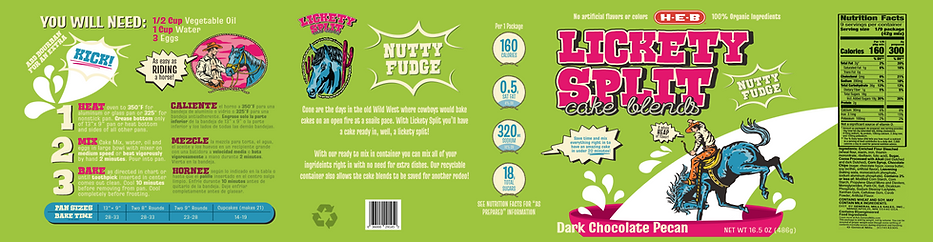
Straying away from the traditional cake box mix, I designed packaging that stands out on the shelf both visually and physically. The tub allows consumers to mix all the ingredients directly inside—no extra bowl needed. Not only does this reduce the number of dishes used, but the container is also recyclable and reusable, giving consumers even more incentive to choose this product.

For my Lickety Split project, I wanted to capture the bold, rich flavors of Mexican and Texan cuisine and blend them into unique cake mixes that celebrate the best of both cultures. Each flavor is a balance of tradition, indulgence, and a little surprise—because what’s a great dessert without an unexpected kick?

Flavors

Dark Chocolate Pecan – A Southern Classic with a Decadent Twist

Chocolate has deep roots in Mexican culture, dating back to the ancient Mayans and Aztecs, who revered cacao as a sacred ingredient. Meanwhile, pecans are a staple of Texan desserts, found in everything from pralines to pecan pie. This cake mix combines the bittersweet richness of dark chocolate with the buttery crunch of pecans, creating a bold and nutty indulgence. The secret ingredient? Bourbon. A splash of this smoky-sweet spirit enhances the depth of the chocolate, adding warmth and a smooth finish that ties together both cultural influences.

FULL WRAP DESIGN

Lickety Split Full Wrap

PREVIOUS
DESIGN

Yogurt Jar Label1.png

*Artwork created by @alexgunawan7390 on Freepik

VIEW A MORE IN DEPTH LOOK ON BEHANCE

back to top

  • Instagram
  • LinkedIn
  • Behance
  • X

@_.LAZYONASUNDAY._

© 2025 by Yareli Moreyra. Powered and secured by Wix

Copyright © Yareli Moreyra 2025. All designs, artwork, and images on this site are original works and the intellectual property of Yareli Moreyra. Reproduction, distribution, downloading, or reposting of any content without explicit written permission is strictly prohibited.

bottom of page